

Photo by Andrew Neel on Unsplash
How to create a custom Dropdown menu with SwiftUI
Compatibility iOS 13+


Introduction
Hi iOS devs! On this tutorial I'm going to show you how to create a really cool completelly custom animated dropdown menu that I've developed with SwiftUI. If you don't want to use the native pickers and is looking for a custom solution, this might be the solution you've been looking for. That's what we are going to build:
Create a new project
Just create a brand new Xcode project and create a new file called CustomDropdownMenu.
Creating the base component
We are going to start by creating the UI for the closed state of the dropdown menu. Let's start by creating a VStack with a Text inside that will be the selected state of the dropdown. We are also going to add a chevron icon on the right to indicate the open and closed state.
struct CustomDropdownMenu: View {
    var body: some View {
        VStack {
            HStack {
                Text("Selected option")
                    .font(.system(size: 16, weight: .semibold, design: .rounded))
                Spacer()
                Image(systemName: "chevron.up")
                .foregroundColor(Color.black)
                .font(.system(size: 16, weight: .regular))
            }
        }
    }
}
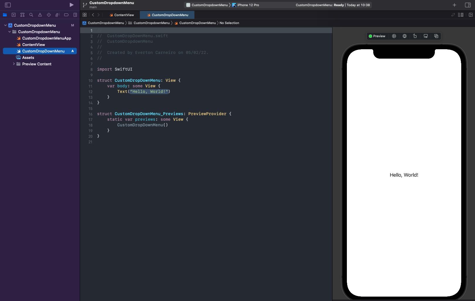
Let's now just add some colors and padding. You can choose any colors you want, I just pick some colors I personnaly like. I've also added some horizontal padding on the previews to make it easier to visualize the component. We'll also need to add a state variable to keep track of the state of the dropdown, if its open or closed. This state should be set to true when the user taps, so we need to add an onTapGesture modifier. Then, we add a state for keep track ot the selected text to be shown.
struct CustomDropdownMenu: View {
    @State var isSelecting = false
    @State var selectionTitle = "Selected option"

    var body: some View {
        VStack {
            HStack {
                Text(selectionTitle)
                    .font(.system(size: 16, weight: .semibold, design: .rounded))

                Spacer()
                Image(systemName: "chevron.down")
                .font(.system(size: 16, weight: .semibold))
            }
            .padding(.horizontal)
            .foregroundColor(.white)
        }
        .frame(maxWidth: .infinity)
        .padding(.vertical)
        .background(Color(uiColor: UIColor.systemIndigo))
        .cornerRadius(5)
        .onTapGesture {
            isSelecting.toggle()
        }
    }
}

struct CustomDropdownMenu_Previews: PreviewProvider {
    static var previews: some View {
        CustomDropDownMenu()
            .padding(.horizontal)
    }
}
This is how our dropdown is going to look like when it's closed:
Creating the dropdown item model
We need to create the items for the dropdown such that you can create multiple items to suit your needs. The idea it's a custom component with a text on the left and an icon on the right, since it's usually how dorpdowns are made. Let's start by creating a model for our dropdown item. We are going to need an a id, a title, an image and a handler to handle the action when the item gets tapped. Let's also make it identifiable so you can easily use with a forEach passing your models and creating the items dynamically.
struct DropdownItem: Identifiable {
    let id: Int
    let title: String
    let iconImage: Image
    let onSelect: () -> Void
}
You are maybe thinking "Why you're using an Int for the id, why not let id = UUID() ?" That's actually a great question. The thing you have to keep in mind is that a SwiftUI view is a function of its state. So every time the state changes and the view rerenders, another UUID would be created and you would lose the dropdown selection, because the id is different and the view wouldn't know what item should be selected. There's many approaches that could solve this, but let's make it simple.
Creating the dropdown item view
So the view is basically a button with an HStack that consists of a text on the left and an image on the right and we are going to just pass in the model to populate it. We also need a checkmark on the left to indicate if this is the selected item or not.
struct DropdownMenuItemView: View {

    let item: DropdownItem

    var body: some View {
        Button(action: { }) {
            HStack {
                Image(systemName: "checkmark")
                    .font(.system(size: 14, weight: .bold))
                Text(item.title)
                    .font(.system(size: 16, weight: .regular, design: .rounded))
                Spacer()
                item.iconImage
            }
            .padding(.horizontal)
            .foregroundColor(.white)
        }
    }
}
So now is where things gets interesting. What should happen when this button gets tapped? First, we'll need to handle the action that needs to be executed on the tap, so we need to pass the handler onSelect(). Then we also need to tell the component that the user is not selecting anymore. Remeber the isSelecting state variable? We'll need to tell the state to close the dropdown, setting this variable to false. We need a binding variable for that. The selected text must be shown on the main component, so we need to set the selectionTitle state to the title of the selected dropdown item, let's add another binding for that.
struct DropdownMenuItemView: View {
    @Binding var isSelecting: Bool
    @Binding var selectiontitle: String

    let item: DropdownItem

    var body: some View {
        Button(action: {
            isSelecting = false
            selectiontitle = item.title
            item.onSelect()
        }) {
            HStack {
                Image(systemName: "checkmark")
                    .font(.system(size: 14, weight: .bold))
                Text(item.title)
                    .font(.system(size: 16, weight: .regular, design: .rounded))
                Spacer()
                item.iconImage
            }
            .padding(.horizontal)
            .foregroundColor(.white)
        }
    }
}
Everytthing is looking good so far. But now we need to know when the item is selected to show the checkmark only for the selected item and hide for all the other ones. Let's create a binding variable for the dropdown item and a state variable for the main component so it knows which item is selected.
struct DropdownMenuItemView: View {
    @Binding var isSelecting: Bool
    @Binding var selectiontitle: String
    @Binding var selectionId: Int

    ...
}
struct CustomDropdownMenu: View {
    @State var isSelecting = false
    @State var selectionTitle = "Selected option"
    @State var selectedRowId = 0

    ...
}
So when the item gets tapped, you need to set selectedRowId to the same id as the item id. We also need to show the checkmark for this item and hide for every other one. We're going to achieve that by setting its opacity.
struct DropdownMenuItemView: View {
    @Binding var isSelecting: Bool
    @Binding var selectiontitle: String

    let item: DropdownItem

    var body: some View {
        Button(action: {
            isSelecting = false
            selectiontitle = item.title
            selectionId = item.id
            item.onSelect()
        }) {
            HStack {
                Image(systemName: "checkmark")
                    .font(.system(size: 14, weight: .bold))
                    .opacity(selectionId == item.id ? 1 : 0)

                Text(item.title)
                    .font(.system(size: 16, weight: .regular, design: .rounded))
                Spacer()
                item.iconImage
            }
            .padding(.horizontal)
            .foregroundColor(.white)
        }
    }
}
Adding dropdown items to the menu
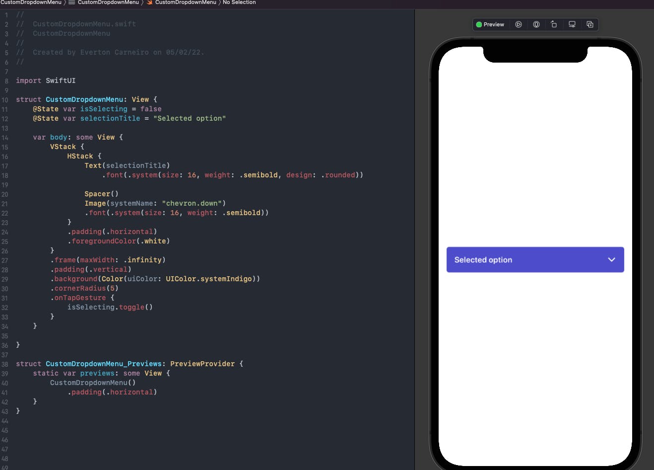
Now let's put some dropdown items on the main component to see how it looks. We just want to show the item if the user is selecting, so we put the items inside an if statement to show only if isSelecting is true. I've also put a divider on top to make a better separation of the selected item from the options.
struct CustomDropdownMenu: View {
    @State var isSelecting = false
    @State var selectionTitle = "Selected option"
    @State var selectedRowId = 0

    var body: some View {
        VStack {
            HStack {
                Text(selectionTitle)
                    .font(.system(size: 16, weight: .semibold, design: .rounded))

                Spacer()
                Image(systemName: "chevron.down")
                .font(.system(size: 16, weight: .semibold))
            }
            .padding(.horizontal)
            .foregroundColor(.white)

            if isSelecting {
                Divider()
                    .background(.white)
                    .padding(.horizontal)

                VStack(spacing: 5) {
                    DropdownMenuItemView(isSelecting: $isSelecting, selectionId: $selectedRowId, selectiontitle: $selectionTitle, item: .init(id: 1, title: "Messages", iconImage: Image(systemName: "envelope"), onSelect: {}))
                    DropdownMenuItemView(isSelecting: $isSelecting, selectionId: $selectedRowId, selectiontitle: $selectionTitle, item: .init(id: 2, title: "Archived", iconImage: Image(systemName: "archivebox"), onSelect: {}))
                    DropdownMenuItemView(isSelecting: $isSelecting, selectionId: $selectedRowId, selectiontitle: $selectionTitle, item: .init(id: 3, title: "Trash", iconImage: Image(systemName: "trash"), onSelect: {}))
                }

            }

        }
        .frame(maxWidth: .infinity)
        .padding(.vertical)
        .background(Color(uiColor: UIColor.systemIndigo))
        .cornerRadius(5)
        .onTapGesture {
            isSelecting.toggle()
        }
    }

}
This is how it looks when it's open:
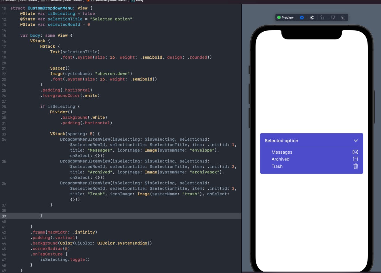
Did you notice something odd? The first time the dropdown appears, none of the items are selected. Depending on the need, this might be the correct behavior. But in most cases we should have a default selection when the view appears, so we're going to set a default selection for our dropdown. We can also just pass an empty string for the selection title, since its state is going to be set when the view appears.
struct CustomDropdownMenu: View {
    @State var isSelecting = false
    @State var selectionTitle = ""
    @State var selectedRowId = 0

     ...

        .onTapGesture {
            isSelecting.toggle()
        }
        .onAppear {
            selectedRowId = 1
            selectionTitle = "Messages"
        }
On the code above the initial state is hard coded, but just for now. We are going to change that in a minute.
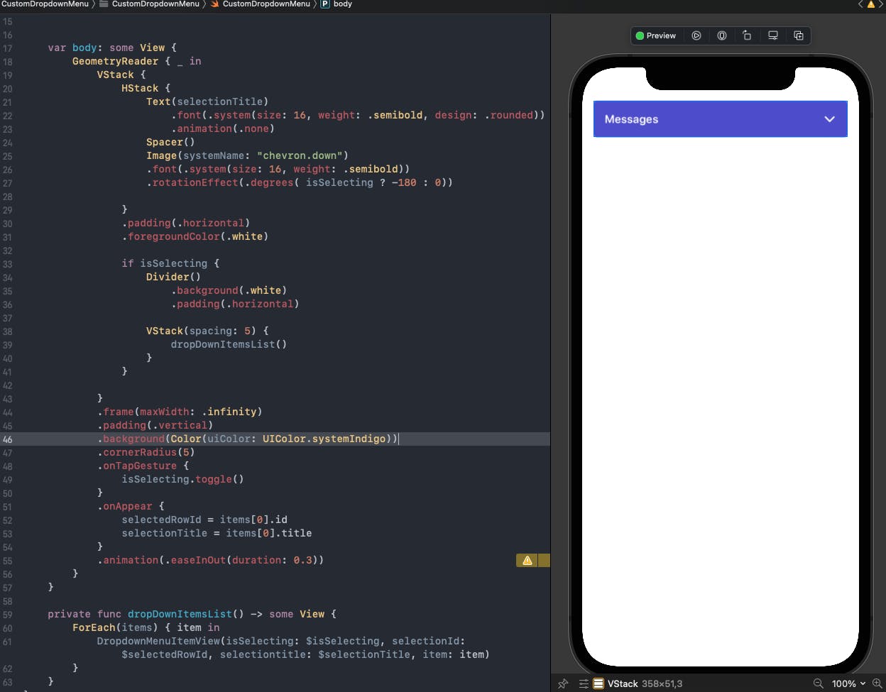
Adding animations
Let's get to the fun part! There's two animations that I want to add: open and closing of the dropdown, and the rotation of the chevron icon, because I think looks cool :D. The opening and closing its going to be carried out by the VStack, since it's going to expand to acomodate the items. For the chevron icon we need to add a rotation effect to also be toggled when the user is selecting. Add a animation modifier on the VStack and a rotation efect to chevron icon binded to the isSelcting state:
  ...

  Image(systemName: "chevron.down")
      .font(.system(size: 16, weight: .semibold))
      .rotationEffect(.degrees( isSelecting ? -180 : 0))

  ...

        .onAppear {
            selectedRowId = 1
            selectionTitle = "Messages"
        }
        .animation(.easeInOut(duration: 0.3))

...
Well, it's animating but something isn't right. The selected text is animating and the dorpdown is animating top and bottom at the same time, and we want the dropdown to just expand down. For the selected text we just add a .animation(.none) to disable its animation. To solve the VStack issue we need to wrap it inside a GeometryReader. This way the component is going to be anchored on the top and the only way it can expand is down.
struct CustomDropdownMenu: View {
    @State var isSelecting = false
    @State var selectionTitle = ""
    @State var selectedRowId = 0

    var body: some View {
        GeometryReader { _ in
            VStack { ... }
            .frame(maxWidth: .infinity)
            .padding(.vertical)
            .background(Color(uiColor: UIColor.systemIndigo))
            .cornerRadius(5)
            .onTapGesture {
                isSelecting.toggle()
            }
            .onAppear {
                selectedRowId = 1
                selectionTitle = "Messages"
            }
            .animation(.easeInOut(duration: 0.3))
        }
    }
}
The animation is looking great now, but there's an anoying detail that caught my eye. You can see the checkmark changing state while the dropdown is closing, and thats really anoyed me. Yes, I know, I'm being picky, but it is what it is. So to fix this I added a little delay to the selectionId state change, like so:
    ...

    var body: some View {
        Button(action: {
            isSelecting = false
            DispatchQueue.main.asyncAfter(deadline: .now() + 0.4) {
                selectionId = item.id
            }
            selectiontitle = item.title
            item.onSelect()
        }) {

     ...
This is the result:
Making the component reusable
The component is now preety much done. The thing is that all the items are hard coded within the component. Now we are going to make it reusable to be able to receive the items dynamically.
To achieve this we first need to receive an array of DropdownItems on the main component. Then we need to create a method to generate the dropdown items dynamically according to the items received.
struct CustomDropdownMenu: View {
    @State var isSelecting = false
    @State var selectionTitle = ""
    @State var selectedRowId = 0
    let items: [DropdownItem]

   ...


    private func dropDownItemsList() -> some View {
        ForEach(items) { item in
            DropdownMenuItemView(isSelecting: $isSelecting, selectionId: $selectedRowId, selectiontitle: $selectionTitle, item: item)
        }
    }
}
Where are the hard coded DropdownMenuItemViews, you can just replace with the dropDownItemsList method. Then you pass on the array of dropdown items on the previews. We also need to set the default id and title state to be the first item of the list, this is how it's going to look like this:
Creating a View extension
One thing that we have to keep in mind is that a drop down should expand and colapse on top of the Content shown, on a different zIndex, otherwise, it's going to push the rest of the content down, so let's create a View extension to put the dropdown on a different zIndex. We also need to give an offset to move the content a little down so the dropdown don't cover any piece of the content. Don't forget to put a higher zIndex for the dropdown.
extension View {
    func customDropdownMenu(items: [DropdownItem]) -> some View {
       ZStack {
            VStack {
                CustomDropdownMenu(items: items)
                    .padding(.horizontal)
                Spacer()
            }
            .zIndex(10)
            self
                .offset(y: 60)
                .zIndex(1)
        }
    }
}
Now got to contentView, we're going to create a simple screen with a list, just to see our dropdown in action.
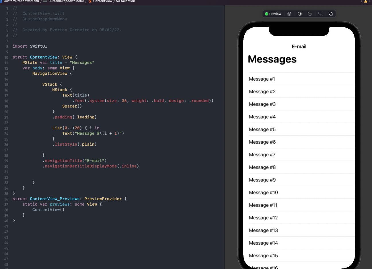
Now we just call our dropdown on the component we want it to be on top. In this example, I want to be on top of the list, below the title. So I just call it on the list and pass an array of items.
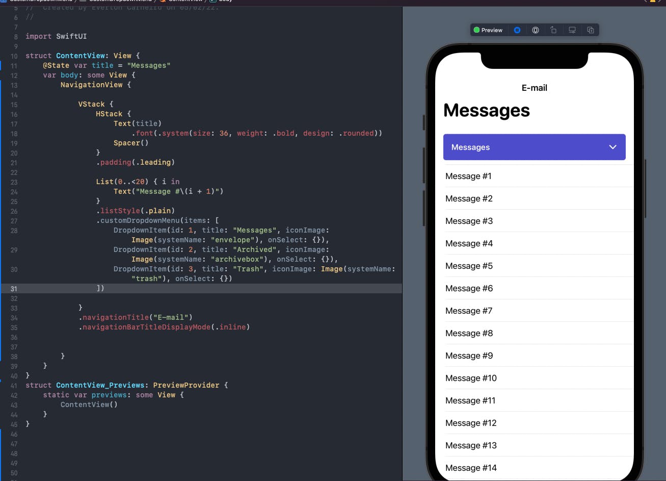
On the onSelect handler of the items you can perform any task you need, perfect for a network call to update your screen with new data. For simplicity, let's just change the title to see it in action.
And our dropdown is done! Did you like the tutorial? I would like to hear your feedback! You can find the complete code on my github here. I'm also on Twitter. See you on the next one! Cheers.